
Hitler and Picasso: when calligraphic expert puts himself at the service of art.
The very recent discovery of a degenerate work of art deprecated by Nazism is making its way around the world. The work would portray in an ironic and satirical key none other than the Führer and could be, according to the art historian Annalisa Di Maria and the researcher Andrea da Montefeltro (both members of the Unesco Center in Florence), born from the hand of Pablo Picasso. The painting, according to art scholars, would be a tribute to Paul Klee by Picasso who may have returned, with this work, the gift received from his friend Klee in 1914.
The pictorial work is missing a signature; a past restoration at the edge of the canvas may have in fact canceled the author’s signature or perhaps, more simply, the author has deliberately omitted to sign it considering the subject dealt with, very hot and dangerous in a Europe crushed by the Nazi regime. However, there is an inscription on the lower lip of the portrait, and it is for this reason that the art historian requested the intervention of the Autografia Association to carry out an appraisal on this writing and to understand if it could really be similar to the handwriting of the Malaguayan genius. .
As we already collaborated with Dr. Di Maria and Dr. Andrea da Montefeltro for other very important works such as the recognition of a signature on a double painting attributable to Matisse and the attribution of a sanguine depicting “the ideal horse” no less that to Leonardo Da Vinci, we accepted with great pleasure the assignment, which then resulted in the international conference “The art on the run from Hitler” held on Sunday 7 August 2022 in the rooms of the Piobbico Castle where, on that occasion, the work under study was unveiled.
Since now the newspapers around the world are reporting the news, with great pride of me and of the whole Autografia Association, we want to share the studies carried out, thus deepening the subject of the calligraphic expertise on the work and, providing the technical details of the expertise , illustrate the reasons why we found the explanation of art historians and researchers plausible:
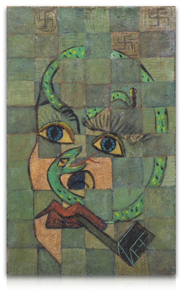
Let’s take a first overview of the work: in a purely Cubist style, a male face is depicted with a pipe in his mouth surrounded by a snake. Above him, three swastikas float inside as many cubes. Within the framework, the two writings we are going to analyze can be identified .
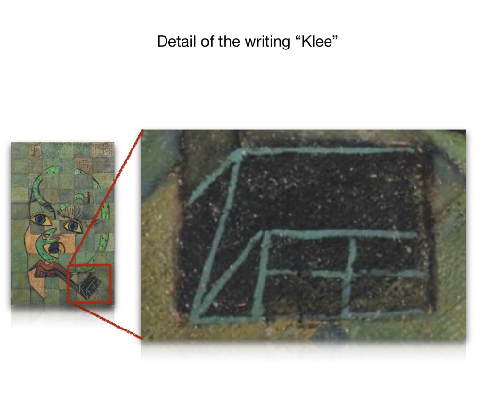
Inside the pipe you can find the first writing: KLEE. The word is perfectly inscribed, albeit stylized, inside the pipe head, creating its contours. If at first sight this writing might look like a signature, the unusual position of it, but above all the graphic gesture, lead me to abandon this hypothesis. Let’s see why …
Examining this signature taken as an example and taken from one of his works entitled “GEOFNET” of 1933, we can appreciate that Klee’s signature on his paintings is very simple but regular and rounded. If we then compare it with the KLEE writing present on the work, you will therefore understand that it is not possible to interpret the writing in the pipe as a signature.
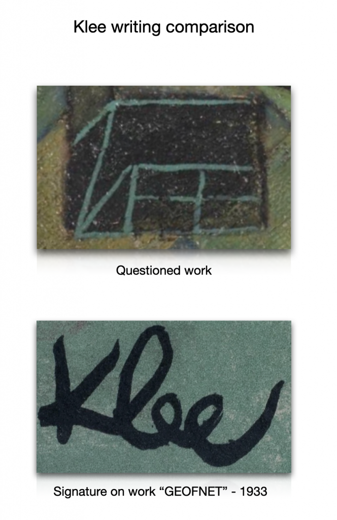
Instead, I would favor the identification hypothesis, namely that the writing Klee refers to the recipient of the work. As we know, despite the famous anti-smoking campaign carried out by Hitler, Klee was an avid pipe smoker and never ceased to indulge in this vice.
Unfortunately this word, being a stylized writing that occupies a very precise and constrained spatiality, is not suitable for making any calligraphic comparison as it is to be considered as a drawing, but it is certainly very important in the conceptual evaluation of work itself.
Let’s analyze the second writing instead .. On the lower lip of the portrait you can see the writing: SCHWEIGEN. The writing occupies a very small space, about cm. 8 x2, delimited precisely by the size of the lower lip.
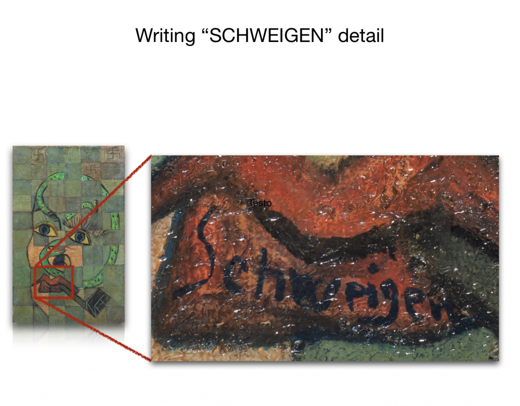
The word Schweigen in German means “remain silent, be silent”…
It is definitely emblematic that the author has inscribed the word “silence” on the mouth of the person portrayed. Is it an invitation? Is this an exhortation to keep quiet in order to preserve his life considering the rampant crimes in Nazi Europe? In fact, we must not forget that Klee, like Picasso, was part of what was defined as “degenerate art”: an art that went against the principles of National Socialism but which did not fail, however, for a pure contradiction in terms, to ensnare the leading exponents of the Nazi party such as Hitler, Goering and Goebbels. The three hierarchs were in fact so attracted to degenerate art that during the Nazi regime they carried out a real spoliation against museums and rich Jewish families from all over Europe to collect thousands of masterpieces which they then used to adorn their residences and the museums of the Reich.
I considered this word, “Schweigen”, suitable for making a calligraphic comparison, and I am now going to show the results of the studies carried out. Don’t worry, it won’t be boring but I am sure you will find the results very interesting.
The study that I am going to present now is therefore aimed at matching the calligraphy present in the painting to that of Pablo Picasso.
First of all, it is necessary to make a necessary premise: there are two characteristics that in our case make the examination of the handwriting more complex.
The first feature is that the writing was made with a paint brush. It is important to know that, due to the positioning of the fingers in holding the writing medium and, above all, due to the softness of the brush tip, the graphic gesture is therefore quite different from that carried out using a pen, a pencil or another writing tool. In addition, writing with the brush forces the author to detach the letters very often, since the brush quickly “discharges” his writing power and therefore needs to be dipped often in color. The signatures and letters wrote with a pant brush, while maintaining characteristics similar to the personage’s usual handwriting, are preferably to be compared with writings obtained with the same method. In this case we do not have this possibility since it was not Pablo Picasso’s custom to paint words within his works.
The second feature is the decidedly reduced space – let’s remember 8 × 2 centimeters – in which the author has inserted the writing; in fact, it is scientifically proven that the space that can be used for writing significantly influences the graphic gesture and its result. If a certain rigidity is perceived in the stroke, this is given by the small size usable by the artist for writing and, above all, by the tool used: the paintbrush.
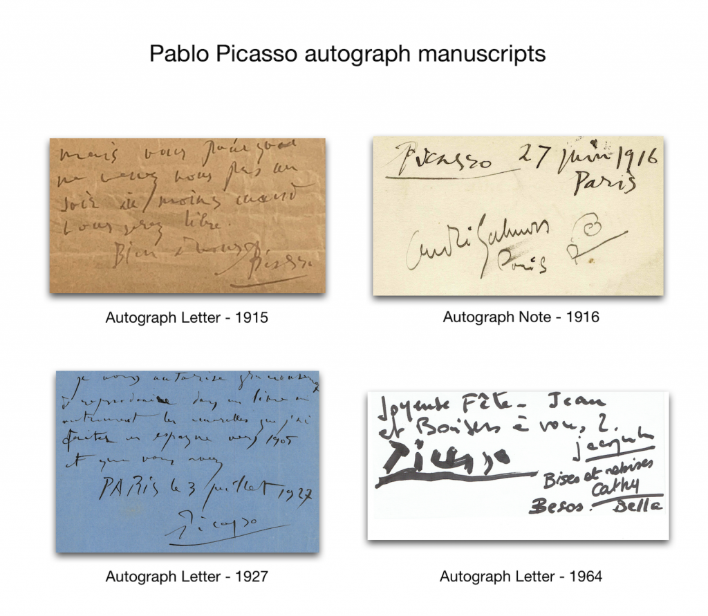
Unfortunately, as already mentioned, there are very few writing samples within Picasso’s paintings and none can be used for a comparison except his signature, and even it not always present. A signature that, however, unlike his handwriting, changes substantially over the years, evolving into a stylization that is therefore not suitable for use as a comparison sample. For the sake of fairness, I must specify that the comparison between a pen or marker and a paintbrush writing can only provide a prudent opinion on authenticity, but unfortunately this is all we have available at the moment.
Therefore, hypotesizing that the painting and consequently the writing were made by Pablo Picasso, let’s proceed with the comparative examination of the two handwriting. We know that Pablo Picasso and Klee have studied at a distance and admired each other for many years and have met on at least two occasions, in 1933 and again in 1937 in Bern at Klee’s studio. Considering the presence of the swastikas in the painting, I tend to consider the second date, 1937 as plausible. This consideration is logical as the swastika, already suggested as a symbol of the National Socialist Party by Hitler in his Mein Kampf, published in 1925, was adopted as the flag of the Third Reich only starting from 1935, therefore knowing from that moment on its maximum and sad diffusion.
As we know, an individual’s handwriting is scientifically divided into three macro periods: the young age, the middle age and the third age.
It is necessary to point out that Picasso’s writing has not undergone substantial changes other than the physiological ones of the third age, and therefore his writing between the young age and the middle age can be considered very similar, as we can see from the picture below.
As we can see, Picasso has a hard time maintaining a regular line of writing and traces the words with a swinging movement, often filling every free space he can find. As if his art grew with him and had to roam free even in writing, devoid of any bond or imposition given by space or convention, this characteristic of Picasso’s handwriting is accentuated over the years, a bit because of the diminished control motor due to age, and a bit because let’s face it, HE was Picasso, and he could also afford the extravagance of writing in an unconventional way.
Let’s now analyze the first letter, Schweigen’s S.
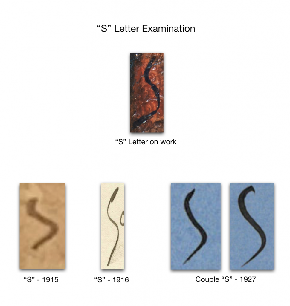
The letter “S” is very particular, with very open arches and it is certainly the letter that makes the calligraphic comparison more solid. The genesis of the letter is at the apex, and it closes with a distinctly descending stroke, inclined to the left. Let’s see above the letters “S” written, unfortunately not painted by Picasso, which I used for the comparison.
Here is a letter “S” from 1915, a letter “S” from 1916, and finally 2 letters “S” from 1927, temporally therefore closer to the presumed dating of the painting.
As we can appreciate, the similarity is truly impressive …
We then move on to the letters “E” and “I”, certainly very interesting to evaluate.
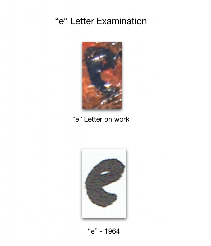
In the painting, the letter “E” has a well-defined eyelet and the descending stroke carried almost vertically. Let’s pay attention to the particular roundness of the eyelet: using an autographed note written with a thick marker in 1964, we can observe how the shape of the letter “E” is actually very similar to that of the painting. The large-tipped marker is the writing tool that comes closest to a paintbrush so this comparison sample, albeit distant in time, is very important. We therefore ascertained that Picasso’s writing has not undergone significant changes over time.
Finally, let’s analyze the letter “I”:
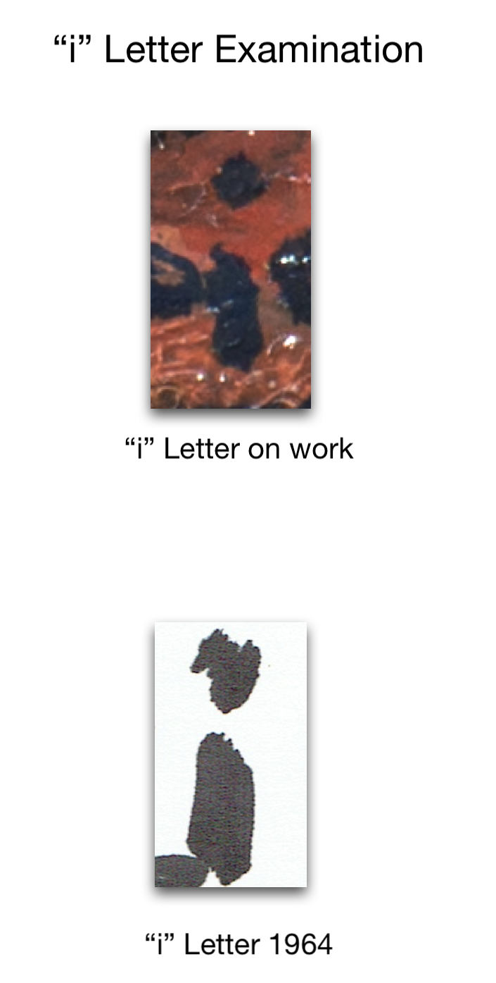
The letter “I” is formed by a rod surmounted by an overwritten point, well straight and marked. Once again we will take advantage of the note written in 1964 with a large-tipped marker.
The two letters are drawn with the same graphic gesture and have the same size and direction, with the genesis of the shaft at the top and the stroke that widens towards the base, where stronger brush pressure is inevitable. The “I” of the note also has the same characteristics: the overwritten point is also almost equidistant to the “I” of the work in question. Again, the similarity is impressive.
These are the findings of our study and I hope you have found this handwriting analysis interesting. At this point I imagine that the question on everyone’s mind is: “but then the painting was really made by Picasso?” The answer to this question is certainly complex …
The work on the writings on the painting cannot and absolutely does not want to provide certainty about its authorship.
Considering who we are talking about, you will understand that providing a certain and unappealable attribution of the work in question to Picasso is a burden that can only be delegated to the experts of the Malaga’s genius. The attribution of such a work is a very complex process that is based not only on objective and perceptive analyzes but also on very precise scientific data, such as laboratory analyzes of the palette and the support, historical and biographical comparisons and, last but not least last, the forensic graphometry of which we have now seen its partial application on the writing present on the work.
The work we have carried out has therefore evaluated the possibility that the SCHWEIGEN writing could have actually been written by Pablo Picasso: the conformation of letters and style absolutely do not deny this chance and we hope that it can therefore provide a valid complement to subsequent studies that will certainly undertaken and which, we hope, can only confirm what was hypothesized by the team of scholars of which we proudly belonged.
Stefano Fortunati
President